Unfortunately, for a lot of websites out there, site architecture can be somewhat of an afterthought. After all, if you’re selling a phenomenal product, shouldn’t it sell itself? Even if you have fantastic content on your website, good site structure makes a huge difference.
Imagine for a moment you’re walking into your favorite grocery store, but they’ve changed all the aisle locations and they’ve removed all the signs. Worse still, you walk down an aisle and find that the pasta is next to the coffee, and the cereal is in the fridge next to the soda. It wouldn’t take long for frustration to turn you away to another store—and if this were your shopping experience, chances are that you’d never come back.
In a grocery store, the arrangement of the product is almost as important as the product itself. On your website, it’s even more important, not only because of the connection between user experience and site structure, but because of how search engines interpret and reward good site structure.
Organization—Good for Usability, Good for Google
From a user standpoint, good site structure means that the layout of the site doesn’t call attention to itself: each item is where you expect it to be. The desired page is easily found, and there’s no difficulty in locating information.
A great way to put this into quantitative data can be found in Google Analytics—a fantastic, free tracking service—which allows you to track the pathways that visitors take while on your site. Of the many “internetisms” you’ve probably heard, the most important for site structure, especially for e-commerce sites, is “three clicks or less.” By tracking visitor pathways as they relate to specific goals (for e-commerce, it might be getting to the receipt page), we can see just how easy or difficult it was for the customer to get there.
Originally, the idea of “three clicks or less” was all about the number of clicks it took to get from the home page to an add-to-cart button, but now a good website takes this idea and applies it to the entire website. When a website requires many clicks to get somewhere, it’s considered “deep,” and when it only takes a few clicks, it’s considered “flat.” The flatter, the better.
From a search engine standpoint, one of the biggest factors of your site is “link authority,” or as some online call it, “link juice.” This link authority is the other driving force behind the need for good site structure. The idea is relatively simple: a link coming from an outside site carries with it a certain amount of authority. Google and other search engines keep track of these links and use them as part of their algorithm for deciding which pages rank above others (along with a myriad of factors that go into ranking)
What’s interesting, relating this information back to site architecture, is how this authority reflects the “three clicks or less” idea. What happens is the authority from the link spreads from that page to the other pages that it’s connected to internally—sort of a geeky version of trickle-down economics. There is only so much link juice per link, so the further away from the original page you get, the less powerful the juice
If you’d like to see this in action, download a tool like SEOQuake and take a look at your website. Go to the page that has most links pointed towards it (for most websites this will be the homepage), and note what that page’s PageRank is. Now start clicking on links on that page and notice how they drop each click. If we start with a home page that has a PageRank of 3, you’ll typically see that rank go down one number for each click away from it, which means pages even a few clicks away will have a PageRank of 0.
Visualize Your Site’s Structure
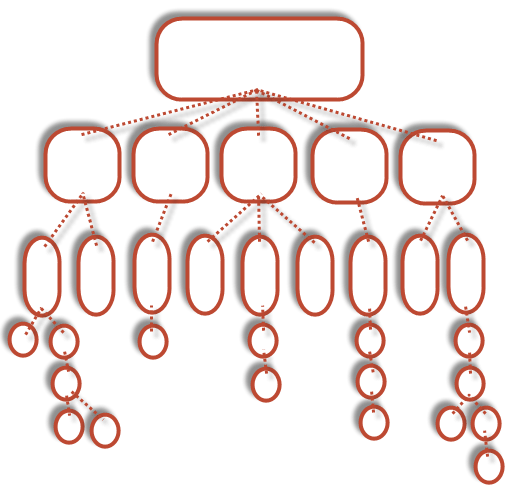
Below, I’ve put together a few crude mockups so you can visualize the ideas I have talked about. The first image shows deep architecture, with each box representing a page and each step down vertically representing the number of clicks required to get to that particular page:

Let’s say the bottom right page is the one I want to get to—it would take six clicks to get there. That’s six different pages of information that the customer has to navigate through, and considering how dense the on page content may be, that’s a lot to ask. Most online shoppers are looking for just one item. Going back to our grocery store analogy, if you went there looking for just one box of cereal, how many unmarked aisles would you be willing to search to find it? The goal is to make your site’s information and/or product as easy to find as possible.
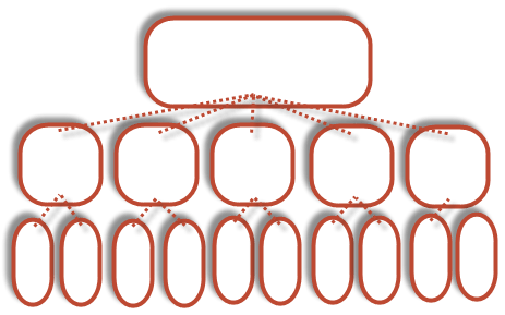
The next image shows a similar site; however, this one employs three clicks or less:

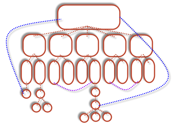
This diagram is certainly an over-simplification—there are obstacles that all sites face that stand in the way of the perfectly flat website, but if we keep this idea in mind it makes some of the more difficult site architecture decisions much easier. Adding a few pages at additional depth makes this diagram look a little more realistic:

The problem with these deeper pages is the distance between them and the page receiving the “juice.” The way we pull these deeper pages up is through additional linking, as shown in blue above. Search engines will follow every link they find on your site, and because of this, we can add additional links to get around the hard structure of the site, thus “pulling” pages up. For example, a strategy that is becoming increasingly popular with larger sites is to place small tables of important links on the footer of their homepage—but it can be accomplished by any placed hyperlink.
Another problem that can occur along with site restructuring is “silo-ing.” This happens when group of pages become segregated from one another. If you look back to the shallow site example, this has already begun to happen, with none of the secondary or tertiary pages linking together. The fix for this is quite similar to what we just did with the deeper pages: however, this time, the goal is to link laterally, instead of vertically (as shown in purple above).
Great site architecture will improve your site’s usability—and customers that can find what they want buy more and stay longer.
