
4 Ways to Improve the Performance of Your Online Forms
")
If the goal of your marketing is to produce new lead, you probably want one of two things when someone clicks on one of your online ads; 1) to call you or 2) to fill out a form on your page so that you can reach out.
Often, there’s only so much you can do on your site to get people to call you, but when it comes to your online forms, there are a lot of factors that can influence whether or not someone fills out your form.
The good news is, a lot of those factors are in your control.
Now, most people don’t love completing online forms. It takes time. It’s annoying. It creates a sense of vulnerability to put your personal information out there.
To overcome these obstacles, filling out your forms needs to be as pleasant and comfortable as possible. Fortunately, there are a variety of ways to make filling out your forms a relatively pleasant experience. Let’s take a look!

1. Give People an Incentive
Anytime you ask someone to give you something, you’re asking them to make a sacrifice. If you don’t offer any sort of value in exchange, people won’t feel very motivated to oblige.
This is especially true when it comes to people’s personal information.
Between the constant deluge of unwanted marketing spam and news reports of cybersecurity breaches, giving out your personal information feels like a real risk. As a result, people don’t want to take that risk unless they think they’re going to get something valuable in return.
One of the easiest ways to incentivize people to complete your forms is to tie your form to a concrete offer. That offer can take a variety of forms: a discount coupon, an eBook, access to an interesting newsletter…the list goes on.
Offers like these are commonly referred to as lead magnets. In essence, a lead magnet is something that grabs the interest of a potential lead and makes them excited to complete your form.
The success or failure of this approach relies heavily on how interesting your offer is. If your offer isn’t compelling enough, people won’t care enough to actually complete your form. In this situation, you may need to improve your offer to improve your conversion rates.
2. Run a Contest
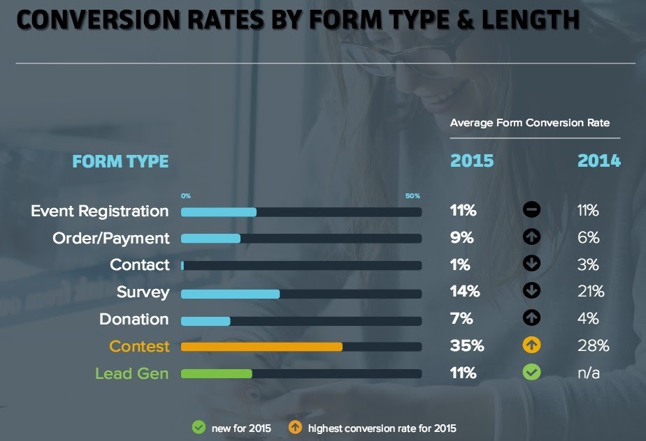
What’s the most compelling offer you can make? Well, according to the Form Conversion Report from Formstack, contests produce the best conversion rates.
The problem with many offers is that you can’t afford to give something expensive to anyone and everyone who fills out your form.
But with a contest, you don’t have to give something to everyone. You only have to give one person a prize for your contest to be incentivizing. Plus—as casinos are well aware—the chance of winning something big creates a sense of excitement that often exceeds the actual cash value of the prize.
Or, as Formstack puts it:
People love having a chance to win. Which means contest forms are a great way to capture new leads and engage with your audience at the same time.
If you really want to make the most of your contest, promote it on your social media accounts. Based on Formstack’s findings, integrating your contest forms with your social media profiles can double your conversion rates.
While contests can work for any kind of business, they’re particularly effective for ecommerce companies. As a quick example, check out this contest from Feedmark.com.

This sort of contest produces value in two ways: 1) you get leads and 2) you get user-generated content that you can use to support later marketing efforts. That’s not a bad return for the cost of a single prize.
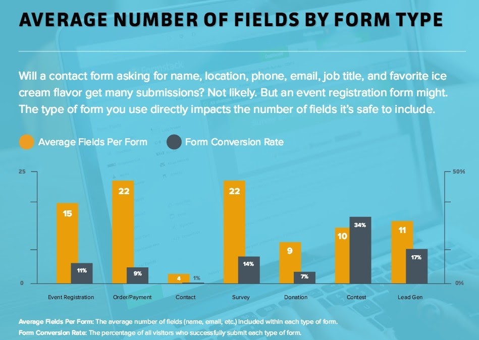
3. Reduce Your Form Fields
If you want people to complete your online forms, it’s a good idea to make your forms as simple to complete as possible. The fewer fields on your form, the better.
After all, the more information you ask for, the higher the perceived risk and the less likely people will be to complete your form.
As a quick example, one of our clients had a form that simply asked for name, email and phone number. But, the client wanted to send people who completed their form marketing emails, so we decided to add an opt-in checkbox. To minimize friction, we even pre-checked the box.
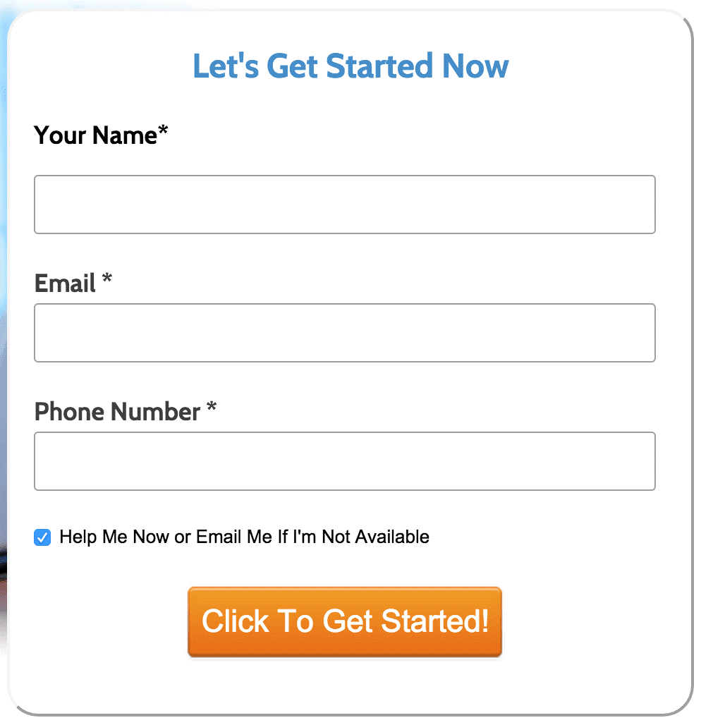
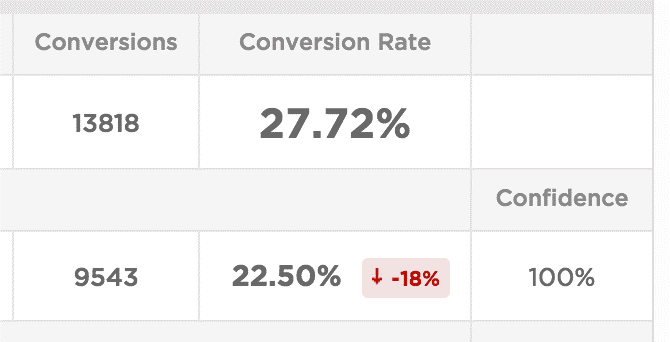
Despite pre-checking the box to minimize friction, adding this single extra part to the form lowered the conversion rate by 5%.
In fact, during our testing period, this version of the form resulted in over 1,700 less conversions. It was a simple change, but one with big consequences.
The big question is, why?
Unfortunately, without asking visitors directly, it’s a little hard to know for sure, but it seems clear that adding a checkbox added more doubt to users’ minds. All of sudden, they stopped filling out the form and started wondering why they were going to get emails. As a result, people were less likely to fill out the form.
With another client, we tried adding a checkbox that said, “I certify that my net worth, including income and assets, is over $100,000” to their form. In addition, they wanted to confirm that users had read a specific legal disclaimer, so we included a checkbox for that, too.
Unfortunately, adding two checkboxes to our form cut our conversions by 75%. However, the client felt like getting users to complete both checkboxes was important, so we had to get creative.
Our solution was to combine the checkboxes. So, instead of having two boxes, we had one with a single field that said something short and sweet like, “I certify that my net worth is over $100,000 and that I have read the legal notice posted below.”
This simple change had a profound impact on conversions. With this single tweak, we saw a 50% increase in conversion rates—all without affecting lead quality. Of course, this didn’t quite get us up to our original conversion rates, but the lead quality was much higher, so it was an all-around win.
At this point, it should be pretty obvious that shorter forms produce more conversions. So, if you’re hoping to improve your conversion rates, it’s always a good idea to start by looking for fields that you can cut (without adversely affecting lead quality too much, of course).
4. Get Creative with Long Forms
But what if your form has a lot of fields and you need most or all of them? What then? Are you doomed to a low conversion rate?
Not necessarily.
People have different expectations of form length for different types of forms. They expect an online payment form to ask for a lot of information, but they’re okay with that because they get rewarded with what they’re buying at the end. A contact form, on the other hand, is supposed to be short—or at least, that’s what people expect.
Referring back to that Formstack report that we mentioned earlier, here’s how form field counts and conversion rates vary across industries.
If the length of your form matches the expectations people have for that sort of form, they won’t have issues converting—even if they would have a hard time giving out that much information on a different type of form.
But, whether your form is supposed to be long or is longer than people think it should be, there are a few strategies you can use to make long forms less intimidating. Let’s take a look at a couple of the most effective.
Multi-Step Forms
The easiest way to make a long form seem more manageable is to break it up into smaller forms. And that’s a data-supported conclusion.
According to the Formstack report, multi-step forms can as much as triple your conversion rate.
If you do go with a multi-step form, you may want to think about using a progress bar. That way, it’s easy for people to see how far they’ve come and how much further they have left to go.
Save Options
If your form is particularly long or may require people to leave to find additional information, giving people the ability to save their progress can make a big difference.
It’s incredibly frustrating to get partway through a long form, only to find that you’ve lost all of your progress. Letting people know that they can save will help them feel more comfortable starting your form…and more likely to actually complete it.
BONUS: Advertise at the Right Time
This final tactic doesn’t actually have anything to do with your form itself. However, how your form is set up and designed aren’t the only factors that can influence your conversion rates.
Sometimes, when people see your form is just as important as the content of your form. If they aren’t in a good place to fill out your form, they may not complete it—even if they might at a different time.
So, if you’re trying to improve your conversion rates, one of the easiest options is to stop running ads at times when people aren’t likely to fill them out.
Fortunately, it’s fairly easy to get at this data if you’re already running ads. For example, in Google Ads, all you have to do is open the Report Editor and create a report that shows how conversions vary by day or even hour of day.
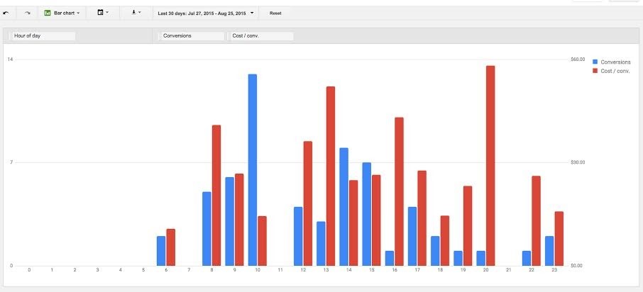
Looking at the report above, it isn’t hard to see that this client generates a lot of conversions at 10:00 am…and almost none at 8:00 pm. To make matters worse, their cost-per-conversion between 8:00-9:00 pm is incredibly high!
With a report like this, it’s easy to optimize your advertising strategy to ensure that your form is getting the best traffic at the best times of day. Even without changing your actual form, this one simple change can help you get much better results out of your campaigns.
Conclusion
If you’re trying to get leads from your online marketing, it’s important to create forms that are as easy and stress-free to complete as possible. No one likes completing forms, so the more painless the process is, the more conversions you will get.
In this article, we’ve discussed a variety of different ways to improve the performance of your online forms. Give them a try and let me know how things go in the comments!