
10 Tips For Effective Website Design: Your Blueprint for Online Success
")
In today’s digital world, your website isn’t just an online brochure; it’s your virtual storefront, your primary sales tool, and often the very first impression potential customers have of your business. Think about it: when someone needs a product or service, where do they usually look first? Online! If your website isn’t up to snuff, you’re not just missing out on a few clicks; you’re losing valuable business opportunities and leaving money on the table.
We have personally scoured through thousands of websites—so you don’t have to!—and compiled the ultimate list of web design tips. These aren’t just about making things look pretty; they’re about creating a powerful online presence that attracts, engages, and converts visitors into loyal customers. Consider this your secret weapon for a website that not only looks fantastic but also works hard for your business, day and night.
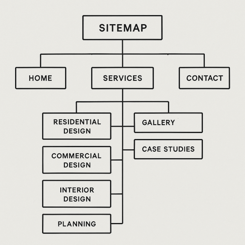
1. Plan Ahead: Build Your Website with a Blueprint
Ever seen a house with a toilet in the kitchen? While it might be convenient for some (you know who you are!), it’s definitely not what most people expect. Just like a homebuilder uses blueprints, your website needs a clear plan to avoid awkward “kitchen toilets.”
Before you even think about colors or fonts, ask yourself:
- What’s the main goal of this website? To get customers to fill out a form, buy a product, call your hotline, or learn something new?
- What’s the purpose of each individual page? Every page should be treated like a landing page, guiding your visitors towards a specific action. You’d be surprised how many pages I’ve seen that just… exist, with no clear purpose!
Define your website’s primary objective and stick to it. This clarity ensures your visitors know exactly what to do and where to go, preventing any confusing detours. Without a clear plan, your website can become a chaotic mess, confusing visitors and failing to achieve your business objectives. A well-planned site, however, effortlessly guides users to the information they need and the actions you want them to take.
- Example: If your goal is to generate leads, every page should subtly nudge visitors towards a contact form or a call.
2. Simplify: Less is More (Especially Online)
The legendary architect Ludwig Mies van der Rohe famously said, “less is more.” This couldn’t be truer for web design. Internet users are, let’s face it, a bit lazy. We want information fast and easy. Overwhelming them with too many elements, colors, or busy layouts is like throwing a wrench in their online journey – they’ll give up and leave.
- Embrace white space: It’s your friend! It makes your content breathe and helps important elements stand out.
- Minimalist color schemes: Aim for a palette of three main colors. While some brands naturally have more, consistency is key. Keeping your color scheme tight makes your website feel professional and easy on the eyes.
The reasoning here is simple: a cluttered website overloads your visitors, leading to frustration and a high bounce rate. When users can’t quickly find what they’re looking for, they leave. Simplifying your design makes your site more user-friendly, improving navigation and the overall experience, which keeps visitors engaged longer.
Example: Think of how Apple’s website uses a lot of white space to highlight their products.Check out samples from Dribble to jumpstart your design.
3. Display Your Contact Information Prominently: Don’t Play Hide-and-Seek!
Some websites seem to be playing a perpetual game of hide-and-seek with their contact information, as if they’re running from an ex! This is a surefire way to frustrate potential clients.
Make it obvious how people can reach you. I always recommend placing your phone number, email, or a prominent “Contact Us” button in the header of your website.
“But I have a ‘Contact Us’ page!” you might say. That’s great! But what if the only page a visitor sees isn’t your contact page? Make it effortlessly easy for them to get in touch, no matter where they land. Stop running from your clients!
The reason this is vital is trust and convenience. If visitors can’t easily find how to contact you, they’ll assume you’re either not serious about doing business or simply don’t want to be bothered. Prominent contact details build credibility and ensure that when a customer is ready to reach out, they can do so without hassle, preventing lost leads.

- Example: A local bakeshop or pastry shop should have its phone number front and center so desperate customers can call immediately
4. Explain Which Location(s) You Serve: Are You Local or Global?
This seems like a no-brainer, right? But you’d be surprised how often I visit a website and can’t figure out if they serve my area.
- For national businesses: Is your shopping cart easily accessible? Can visitors quickly see where you deliver? Do you have clear product/service listings per region if applicable?
- For local businesses: Is your service area clearly stated? Do you have a local phone number? If you have a storefront, is the address visible?
Make it immediately clear whether you’re serving the block, the state, the country, or the world. This helps visitors quickly determine if you’re the right fit for their needs. Clearly stating your service area helps qualify leads and prevents wasted time for both you and your potential customers. It ensures that only relevant visitors engage with your site, leading to higher conversion rates from genuinely interested parties.
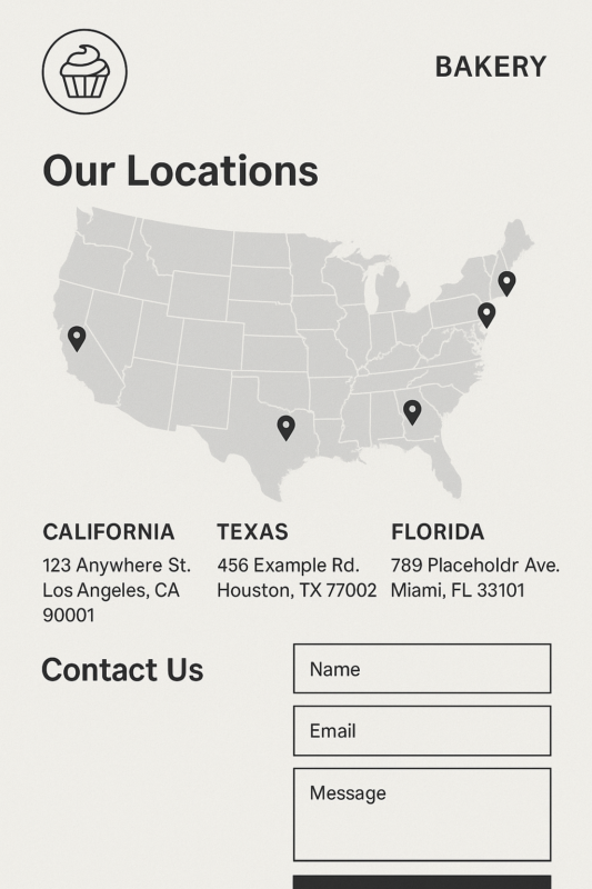
- Example: A bakery that only serves a specific city should list its address and delivery radius clearly.
5. Make Your Website Responsive: Go Mobile or Go Home!
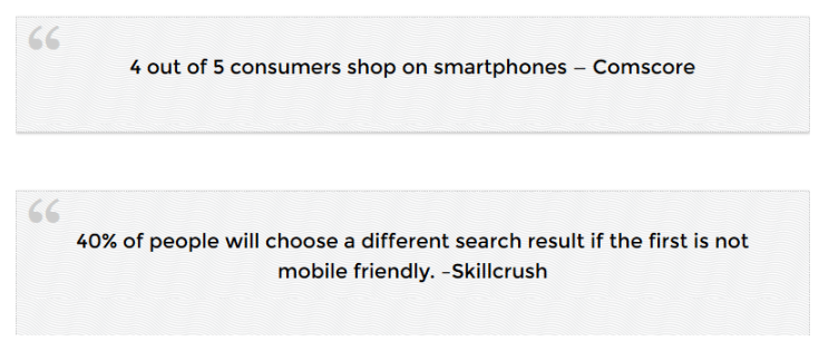
A responsive website is a must-have, not a nice-to-have. It means your website automatically adjusts its layout and viewing area to fit any device – phones, tablets, desktops, you name it. Why is this so crucial? Because most of your potential customers are looking at your site on their phones!
Consider these eye-opening stats from Pew Research Center:
- 60% of people in the US and UK access the internet mainly through mobile devices.
- 46% of smartphone owners say their smartphones are something “they couldn’t live without.” (Seriously, try leaving yours at home for a day – panic sets in, right?)
- Nearly two-thirds of adults in the United States own a smartphone.
- 34% of smartphone users go online using mostly their phones, not a desktop or laptop.
- 46% of people using mobile devices report problems viewing a static (non-responsive) site.
- 44% of people surveyed claim websites were difficult to navigate on smaller devices.
You might be thinking, “My audience doesn’t use mobile devices.” While that’s technically possible, it’s far more likely they do use mobile devices but aren’t visiting your non-responsive site because it’s a pain! Smartphone usage is only increasing, so make sure your website is ready for its close-up on any screen. The reasoning is clear: a non-responsive site alienates a massive segment of your potential audience and provides a frustrating user experience, leading to high bounce rates and missed opportunities. Furthermore, Google prioritizes mobile-friendly websites in its search rankings, meaning a non-responsive site will actively hurt your SEO.
- Example: Imagine trying to read tiny text and click microscopic buttons on your phone. Frustrating, right? A responsive site prevents that.
- Test your own site’s mobile-friendliness with Google’s Mobile-Friendly Test Tool or BrowserStack.
6. Be Obvious: You’ve Got .05 Seconds!
Did you know users form an opinion about your website in just 0.05 seconds? Unless you’re a super-fast insect or a NASA computer, that’s not a lot of time! Your website’s objective needs to be crystal clear, instantly. The design is the very first factor in whether a user sticks around.
A visitor should be able to glance at your webpage for a split second and immediately grasp:
- What is this page about?
- What product can I buy here?
- What service do you offer?
- What’s this blog post discussing?
Initial impressions are critical for establishing credibility. If your website looks untrustworthy or confusing, why would users trust you? Quick test: Go through your website, page by page, and try to understand its message in a blink. Better yet, ask a friend or someone unfamiliar with your business to do the same. If they’re scratching their heads, you’ve got some clarifying to do! The crucial reasoning here is that you have a fraction of a second to capture attention and convey value. If your message isn’t obvious instantly, visitors will bounce. A clear, immediate message establishes credibility and encourages users to explore further, impacting your engagement and conversion rates.
- Example: A landing page for a new software should immediately show what the software does and who it’s for.
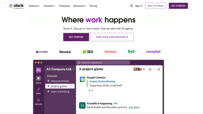
A clear call to action on the landing page like Slack is crucial to get conversions.
7. Include Strong Calls to Action: Don’t Just Cross Your Fingers!
What’s the one thing you want a visitor to do on your website? Call for a free consultation? Sign up for your newsletter? Buy a product? Use your service?
Think of it this way: If you owned a grocery store and needed to sell a specific brand of cereal, you’d create a promotion, right? Having poor or no calls to action on your website is like the grocery store owner just crossing their fingers, hoping people magically stumble upon that cereal!
Believe it or not, 70% of websites don’t have a clear call to action! That’s 70% of businesses just hoping for the best. Don’t fall into the “fingers-crossed website” trap!
My main point here isn’t about specific colors or fonts (though those matter too!). It’s simply to have a call to action. Make it incredibly visible and noticeable. And here’s a bonus tip: Surround your calls to action with strong reasons why someone should take that step. (Why call now? Why sign up? What’s in it for them?) The reasoning for strong calls to action is fundamental: they directly guide your visitors toward conversion. Without clear directions, users are left wondering what to do next, leading to missed opportunities for sales, leads, or engagement. A well-placed, compelling call to action is essential for transforming passive visitors into active customers.
- Example: Instead of just “Contact Us,” try “Get Your Free Quote Today!” or “Download Our E-book and Boost Your Sales!”, the landing page should easily show what you need your customers to do.
8. Tell Visitors Who You Are: Your Secret “About Us” Weapon
Big companies spend billions on branding. Most small businesses don’t have billions (and if you do, you’re not a small business anymore!). But here’s a secret weapon that won’t cost you a dime: an “About Us” page!
“About Us” pages are often underutilized, but they’re incredibly powerful. This is where you can differentiate yourself from the faceless corporations by putting a human face and a name to your business. One case study even showed a 102.5% increase in sign-ups after including a picture of a customer or owner!
Your “About Us” page is where you build trust (unless you have one of those faces – you know who you are!) and help visitors connect with your story. It could be the deciding factor between someone calling your company or looking elsewhere. Use your personality to answer key questions:
- Who are you?
- How long have you been around?
- What makes your business special?
- What makes you, well, you?
Unleash your secret “About Us” page weapon! The reasoning is clear: people do business with people they trust. An “About Us” page humanizes your brand, builds rapport, and provides the transparency that today’s consumers demand. This personal connection is vital for converting curious visitors into loyal customers who feel a genuine connection to your business.
- Example: Share your company’s origin story, your values, and photos of your team.
9. Use a Readable Font/Text Size: Ditch the Fine Print and CAPTCHAs
You know those TV commercials where a rapid-fire voice lists a gazillion side effects at the end? “May cause dizziness, nausea, existential dread, or even death!” That’s the “fine print.” It makes you nervous because you can’t quite grasp what’s happening, right?
Avoid the “fine print” as the main text on your website. I’ve seen fantastic content lose all its value because it was published in minuscule print. If your customer wants to read your amazing content, let them! Use a legible font size and a clean font style. You can even test your website’s text size with Google’s Mobile-Friendly Test.
And remember those infuriating CAPTCHA codes? (Fun fact: CAPTCHA stands for “Completely Automated Public Turing test to tell Computers and Humans Apart.”) They’re frustrating, hard to read, and sometimes you just give up. Don’t subject your readers to the “CAPTCHA code treatment” with unreadable or overly crazy fonts. Your font choice should reflect your brand, but above all, it should be easy to read. The simple reasoning here is user experience. If your text is difficult to read, users will quickly become frustrated and leave your site. Ensuring readability means your valuable content can actually be consumed, improving engagement, time on site, and ultimately, your chances of conversion.
- Example: A professional business blog should use a clear, sans-serif font like Arial or Open Sans at a comfortable size (e.g., 16px or 18px for body text).
10. Decrease Load Times: The Need for Speed
I’m going to reiterate: people online are lazy. A slow website is the digital equivalent of making someone wait 30 minutes for a table at a restaurant when they don’t even know what’s on the menu yet. They’re just going to leave.
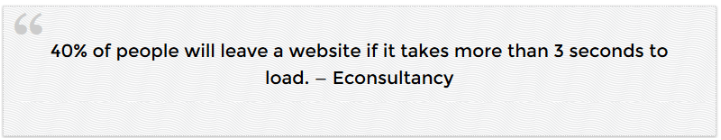
No matter how awesome and well-designed your website is, it won’t matter if people never make it to your website because it loads too slowly. Your website’s speed is crucial for user experience and, yes, even for your SEO! The reasoning is critical for both user satisfaction and search engine ranking. Slow load times lead to high bounce rates, as users won’t wait. Moreover, search engines like Google penalize slow websites, pushing them down in search results. A fast-loading site keeps users engaged and improves your visibility, which is essential for getting found online.
- Example: Large, unoptimized images are often culprits for slow loading times.
- Sample Link: Use this website speed test tool (Google PageSpeed Insights) for personalized ideas on how to improve your website’s load times.
Ready to Turn These Tips into Action?
Is your website performing its best? Curious about your current online presence?
As an SEO company, we know that a strong website is the foundation of online success. We specialize in helping businesses like yours not only look good but also get found by your ideal customers.
Don’t leave your website’s success to chance! We can help you implement these tips and more. Learn our SEO process and see how we can help you.
Get Your FREE SEO Score Today!
Find out exactly how your website stacks up and get personalized recommendations to boost your visibility. Click here to get your free score and let’s make your website work harder for you!
Original blog created last February 2016 and updated on July 2025.