14 Ways to Boost Landing Page Conversions with Visuals
No matter how much we talk about traffic or impressions, conversion rates are often ultimately the most important metric websites track. After all, without conversions, there would be no earnings, and subsequently, no website.
Today, we’re looking at ways to boost your landing page conversions with the help of one simple website element: visuals.
Let’s dive in.
The importance of adding visuals to your pages
Most people are naturally visual creatures. Yes, the copy you write is of incredible importance, but reading copy takes time. Glancing at an image, on the other hand, only takes a second, and the response can be immediate.
We tend to remember only 20% of what we have read, but as much as 80% of what we have seen. Ultimately, this means that a lack of visuals on your landing pages can actually be losing you customers.
Not to mention that visuals are not just a great way to add extra value and an extra layer of meaning to your words, but they are also a good way to break long chunks of text up into smaller and more manageable pieces.
Types of visuals to add to your landing pages
There is more to visuals than product images and videos. Here are some other ways to add them to your landing pages:
Data-focused aids
Presenting stats and numbers is best done with the use of graphs or charts. This makes them easier to understand and digest. This way, you are also able to provide more in-depth information and boost the chances of your page being shared further as well.
Here is an example of the clever use of charts from Backlinko – while Brian Dean does talk about the stats in words, he also has a visual illustrating every point.
Testimonials
Source: dribbble.com
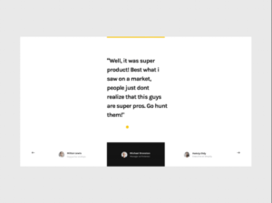
Adding social proof to your landing pages is an excellent way to lend them more credibility and boost conversions. Visitors like to see what others think about your product or service, so showcasing reviews can be an exceptional conversion tactic. Make sure they are realistic and authentic, though, as fake reviews make for horrible user experience.
Here is a great example of adding testimonials to a page – unobtrusive, yet easy to spot and read through.
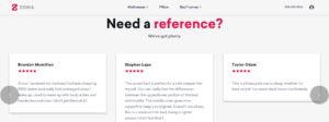
Souce: zomasleep.com
Videos
Videos on landing pages are becoming more and more popular, which is why you shouldn’t use them just because others are – you need them to add real value to the page.
Demo videos are a great choice and work really well for SaaS products. Tutorials are also great, and they can be used in most niches, from beauty to automotive.
You can post a video interview or a glimpse into your company, too – just make sure the video is not your only selling point. Not everyone will want to click on it or have time to watch it, as, let’s face it, it’s still faster to skim through an article than to watch a video.
Leadpages has a great example on their homepage that can be useful – it’s not a must-watch, it’s edited extremely well, and it is highly likely to convert a large percentage of its viewers.
Screenshots
While we’re on the subject of demos, you don’t have to show your product in action or how it works via video – you can do it with a screenshot, too.
Screenshots are also great for SaaS. They’ll showcase the product without wasting time on the video, and they are great for demonstrating how your solution solves a particular issue.
Illustrations
If you don’t want to focus on photos and screenshots, illustrations can be a great way to add a whole lot of personality to your landing pages and overall website. Though they will be more time-consuming to create, they can certainly make you more memorable.
Something like this can be unique and colorful, demonstrate the kind of brand you are, and communicate your points to your audience extremely well.
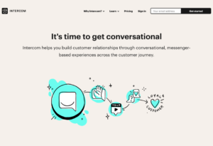
Source: intercom.com
Infographics
Infographics have been around for ages, which is why most people consider them a bit outdated and old, but they are nothing of the kind. They remain a great way to digest a lot of information in a relatively small space, and users still love them.
They’re also a great way to promote your landing pages, as you can build yourself some nice links by cleverly using the same infographic.
Here is a great example of condensing a lot of information easily, and here is another extremely useful and well-designed one. Of course, this format will only work in some cases, so you won’t be able to create an infographic by default.
GIFs
GIFs may not appeal to every brand, as they’re a bit more informal and appreciated by a certain kind of audience, but they can also be leveraged to great use.
More often than not, they can deliver a pun better than copy can, they can establish rapport between the writer and the reader as they evoke a shared sense of culture and humor, and they are a great way to add a little color to your work.
You can, of course, design your own GIFs, and craft a brand story that is completely unique to you.
How to use your visuals
Now that you have a more general idea about the different visuals you can use to enhance your pages and boost conversions, let’s look at some additional tips and tricks that will take your landing pages to new heights:
Tell a story – and only one
It’s easy to try and shove a whole bunch of creative designs into a single page. However, more than one story per page is incredibly distracting, and it will not communicate your message as well as you had hoped.
Choose one story you want to tell, and use your visuals to boost the value and the message of that particular story. For example, here is a page that bases its visuals on the tagline – they play with the space and astronaut theme very well, and stick to one story that highlights their services.
Sticking to a single theme throughout your website is also advisable. It will speak to brand integrity and uniformity, and you’ll remain recognizable without confusing your visitors.
Help them identify with the product
You want your customers to feel you are like them in a way, and that what you offer is what they are looking for. If you manage to bridge the empathy gap, it will be much easier for them to imagine themselves using the product.
You can achieve this by using images of an ideal version of your target customer, like in this example from Voya.

Source: voya.com
You can, of course, use images of actual customers using the product – which is often the best solution. Always take your target audience into account, though, and try to select an image you feel most of them will find it easy to identify with.
Make them feel a certain emotion
Ever wonder why people in commercials look happy? Or why people in the “before” shots look absolutely miserable, and those in the “after” shots are full of joy?
Marketers have always known that in order to make you feel a certain emotion, they need to show that same emotion visually. Words are fine, but they don’t quite make the cut.
This is why you will always see the party going down in a Coca Cola advert, or their famous Christmas commercials with the children and Santa.
To make the most of your visuals, consider what emotion you want users to feel when they land on your page – is it calm, is it joy, is it a bit of fear? Then try to think of the best way to convey that same emotion with an image.
Let’s take a look at a couple of examples:
- Here is one that is very easy and straightforward, but one that inspires a lot of trust at the same time.
- Here is an animation that goes from fear to calm.
You get the idea.
Use color psychology
Different colors will elicit different emotions in your audience, and using them carefully can boost your visuals even further.
Read up on the theory a bit, learn which color is best used for what kinds of messages, and play with the way you construct your visuals. Something as simple as changing the shirt a model is wearing on an image you want to shoot can make all the difference.
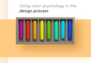
Source: dribbble.com
Bear in mind that these colors need to align with the overall color theme of your website, and that you can’t just keep adding different colors to different parts of your page and hope they have the right effect.
It’s more about choosing one emotion and one set of colors you want to go for, and spreading them around your landing page in a cohesive and visually appealing manner.
Be original
Try not to use stock photos unless you have to – chances are other brands are using the same images to tell their own stories, and someone might come across your website having already tied a certain emotion and thought to the same image.
Not only that, but original visuals are a great promotion tool, and they also make you more recognizable.
When you create your own unique visuals, you are taking ownership of the story you’re telling with them, which means there’s absolutely no confusion about the message and the emotions you want to convey.
Don’t be afraid of white space
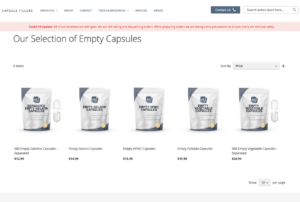
White space is the absence of visuals, and you need to make sure you’re using it wisely. You want to keep your pages light and flowing, as opposed to overcrowded and full to the brim of different signals and attention-grabbing elements.
The aim of white space is to highlight the visuals and copy you are using – so use it cleverly.
Here is a nice example that illustrates this point extremely well – the products are the main feature of the page which focuses your attention directly on them.
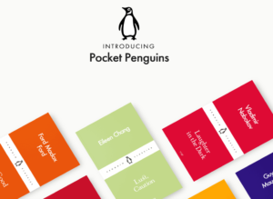
And another one, this time using colored space to the same effect.
Don’t forget optimization
Finally, there is one more very important point we need to touch upon – optimizing your visuals.
First, you need to make sure all of them are optimized for different screen sizes and different devices. Something that looks great on desktop will look horrible on a phone in portrait mode, for example.
When choosing your visuals, think about how they will appear on different orientations and screen sizes. Not all of them may work in every instance, so you might want to consider removing or changing some of them for mobile.
You also need to make sure your visuals are loading properly, and that they don’t disrupt the flow of the entire page if they don’t load when the page does. It’s simply terrible UX to have to keep scrolling up and down because the copy you are reading keeps moving as new images keep being loaded.
Final thoughts
Using visuals to enhance your landing pages should be a given. After all, they add so much more to the story and lend an entirely new feel to your pages. However, using them without any consideration for the message they are sending and only adding them for the sake of having a visual element on the page can do you more harm than good.
Think about your target audience, your brand’s voice, and the overall message and emotion you want to convey with a page, and choose all of your visuals accordingly. What will make your copy resonate better? Can the visuals help you make a sale? What is it that can help someone choose to convert, as opposed to click off the page?
Once you have all of that down, it will be much easier to select the best visuals for your landing pages.


