
Think Mobily: 4 DIY Ways to Take Your Site Mobile

It’s no secret that the Internet is going mobile. In fact 40% of surveyed users typically leave a site within 3 seconds if it’s not optimized for the device in their hands. And 30% of mobile users abandon a purchase completely if they can’t carry it out from their mobile device. 
The first step to making your site responsive is understanding there is no magic button that will make a fully functional site work across all screen sizes with the exact same design elements. However, there are a couple alternatives that will allow your site to optimize for mobile devices in a simpler format.
Finding the right solution is a balancing act between complexity, cost, and quality. If you have neither the knowledge nor the time to learn how to make your site a high-quality mobile experience on your own, or if your site is a large project that needs to be ready immediately to attract the attention of high profile clientele, pay a professional to do it for you.
Like most things in life, your site is only as good as the investment you put into it. That said, if you don’t have the resources to hire a web developer or learn to build a responsive site yourself, there are cheaper alternatives that can save you time and money:
Pre-Built Mobile Themes
If your site is running through WordPress or another CMS (Content Management System), you can find a variety of themes for these configurations that are also mobile. These themes typically range from $35–60, and they are designed to fit the specific needs of a variety of sites. Whether you own a restaurant or are an Internet Service Provider, there’s a pre-built theme for you.
Before downloading and paying for a theme, check out the live preview to be sure it’s what you want and that it’s responsive. A good way to verify this is to slowly reduce the width of your browser until it’s about 2.5 inches wide. If the site adapts to your movement, the theme is responsive. If you have to scroll sideways to read all of the content, pick another theme.
If you aren’t already committed to a non-responsive theme for your site, buying a pre-built mobile optimized theme is definitely the best way to go.
Separate Domains for Different Device Widths
Although there are plugins that can create a separate, mobile-friendly domain for free, there are several reasons you shouldn’t go the m.website.com route. It is an outdated method of making your site work on more than just a desktop. This method could also indirectly affect your SEO (see why here: https://moz.com/blog/seo-of-responsive-web-design). Focus instead on serving different experiences for different device widths on the same domain.
Media Queries for Making Your Site Responsive
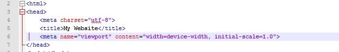
First off, your site’s code needs to know the width of a user’s screen, and there’s no better source for that than the individual devices that visit your site. To let your browser know a phone’s dimensions, place a viewport tag below the title tag of your site in the head of the code. In the image below, the viewport tag resides below the title tag on line 6. After implementation, your browser now can use the width of the viewport to compare it to any media queries you have set up in the code.
Now set up media queries to style each type of device differently based on ranges the screen width could fall into.
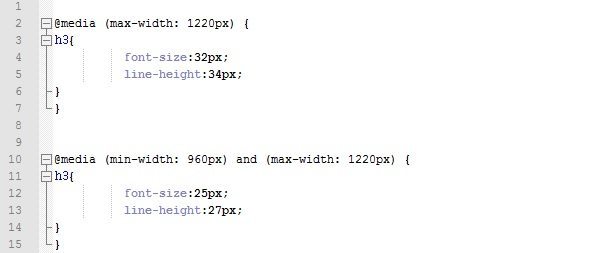
In the image below there are two media queries, one targeting screen sizes of 1220 pixels wide or less (between lines 2 and 7) and the second targeting any size between 960 and 1220 pixels wide (between lines 10 and 15). The second query overrides the first because it appears later in your stylesheet, just like regular CSS.
Just place any CSS you want to behave differently at these targeted screen sizes within the curly braces and it will behave the same as if you had coded this part in a regular style sheet.
Suppose your tablet’s width fell inside this range of your second media query , the H3s would then have a font size of 25 pixels because they’d take precedence over rules you had set before on your H3s.
Most often on our website build, we set media queries to change at 1220px, 1050px, 960px, 768px, and 479px.
Mobile First Frameworks
If you don’t want to work with WordPress but you’re fairly comfortable with coding HTML and CSS and web file management, another good alternative is utilizing mobile first frameworks like Bootstrap or Foundation.
Bootstrap and Foundation are code structures that were created with mobile web design in mind. They come with a lot of pre-built CSS classes and Javascript libraries that can make coding your own site a lot easier and faster.
Some downsides to this approach are that mobile-first frameworks can become a bit bulky when storing extra features. This extra storage can affect the load time of your site by bogging down servers with unused files. Also, when using someone else’s code, you have to dedicate time to reading the documentation of the framework you want to use in order to get it to do exactly what you want to. And that’s fine if you plan on building multiple sites, but if you only plan to work on one, mobile first frameworks might not be the best option.
Although there is no magic “make my site responsive” button, these options can allow visitors to surf your website on phones or tablets in no time.
Sources:
Why responsive sites are better than mobile specific domains:
https://moz.com/blog/seo-of-responsive-web-design
Pre-built WordPress themes:
https://themeforest.net/category/wordpress
How to use media queries:
https://googlewebmastercentral.blogspot.com/2012/04/responsive-design-harnessing-power-of.html
Mobile first code frameworks:
https://getbootstrap.com
https://foundation.zurb.com/