
Why Your Small Business Website Needs to Go Mobile-First
Ever tried to quickly find a local restaurant's hours on your phone, only to be met with tiny text, squished images, and buttons that are impossible to tap? Or maybe you've tried to order something online from a site that doesn't look right on your smartphone? If you have, you know how frustrating it can be.
Well, here's a secret: your customers are experiencing the same frustrations if your website isn't optimized for their phones first. And that's a big problem for your small business.
Think about it: how often do you reach for your smartphone versus your desktop computer? If you're like most people, your phone is practically glued to your hand! This isn't just a hunch; it's a fact.
More than 60% of overall web traffic comes from mobile devices. Globally, mobile users now account for a leading market share of 64.25% compared to desktop users. People spend an average of 3 hours and 15 minutes on their phones daily, with millennials clocking in over 5 hours and 40 minutes. The average person checks their phone 58 times a day. These numbers clearly show a massive shift from desktops to mobile devices.
That's why "mobile-first design" isn't just a techy buzzword; it's a fundamental strategy for your business's online success. It means building your website so that it looks and works perfectly on smartphones before you worry about larger screens, such as tablets or desktops.
Why is this so critical for your small business? Ignoring mobile users means ignoring a significant portion of your potential customers. A mobile-first approach helps you:
- Reach More Customers Where They Are: With most people browsing on their phones, you need to be easily found and accessible there.
- Boost Your Google Rankings (Hello, SEO!): Google prioritizes mobile-friendly sites in its search rankings. A mobile-first site aligns perfectly with Google's mobile-first indexing policies, which can significantly improve your visibility and help potential customers find you. Want to see how your site stacks up? You can get a free SEO score from our website!
- Deliver a Seamless User Experience: When your website is clean, efficient, and easy to use on a phone, visitors are more likely to stay, explore, and convert into customers. This means faster load times, too, which is crucial on slower mobile networks.
- Future-Proof Your Online Presence: The mobile trend isn't slowing down. By adopting a mobile-first approach now, you're preparing your website for the continued dominance of mobile traffic and emerging technologies, saving you the cost of costly redesigns later.
- Focus on What Matters Most: Designing for a small screen forces you to prioritize essential content and functionality, stripping away clutter. This results in a more focused and effective website that guides users directly to what they need.
What Exactly Is Mobile-First Website Design?
So, you understand why mobile matters, but what does "mobile-first design" actually mean in practice?
Imagine you're building a house. A traditional approach (what we call "desktop-first") would be to design a sprawling mansion with all the bells and whistles, and then try to squeeze it down into a tiny apartment. A lot gets lost or broken in translation.
Mobile-first design flips that idea on its head. Instead, you design the most efficient, functional, and beautiful tiny house first. You focus on the absolute essentials, making sure every inch counts and every feature works perfectly in a compact space. Only once that little house is perfected do you start adding rooms, a bigger yard, and extra luxuries to create a larger, more elaborate home.
In web development terms, mobile-first design is a strategy that prioritizes designing for smaller screens, such as smartphones, before scaling up to larger devices. This means your website starts its life optimized for mobile users, who make up a significant portion of internet traffic. You focus on the core functionality and user experience first. This process often begins with sketching or prototyping the web app's design for the smallest screen and gradually expanding to larger screen sizes.
This approach forces designers to remove anything unnecessary for seamless website rendering and navigation, especially because devices with smaller screen sizes have space limitations, compelling teams to ensure key elements are prominently displayed.
Historically, websites were often developed primarily for desktops. Developers then attempted to modify these websites by reducing functions to enhance browsing on mobile or tablet devices – an approach commonly known as Graceful Degradation or the Desktop-First approach. The big downside? Many web elements do not adapt well to smaller screen sizes, resulting in a degraded visual appearance on mobile devices. Mobile-first design (also known as Progressive Enhancement) emerged to address this, encouraging designers to begin with the smallest devices and then add more functionalities for larger screen sizes.
Mobile-First vs. Responsive Web Design: What's the difference (and Why Does it matter to you)?
You might have heard the term "responsive web design" alongside "mobile-first." While they're often used together, they're not quite the same thing, and understanding the difference can help you appreciate the power of a mobile-first strategy.
Think of it this way: Mobile-first design is a strategic approach – it's about how you start building. Responsive design is a set of techniques – it's about how your site adapts to different screens. The best websites today employ a mobile-first strategy, complemented by responsive design techniques.
Here's a quick look at the key differences:
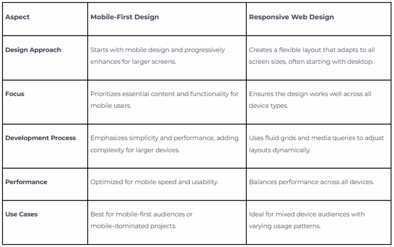
In essence, mobile-first design is a strategy that dictates your starting point and priorities, while responsive web design is a technique (using flexible layouts and code) that helps your design adapt across screens. You can have a responsive website that wasn't built mobile-first, but the best responsive websites are built with a mobile-first approach. This combination ensures your site is lean, fast, and user-friendly on every device your customers use.
How to Implement a Mobile-First Approach for Your Small Business Website (Even if You're Not a Coder)
Okay, so you're convinced that mobile-first is the way to go. But how do you do it? Don't worry, you don't need to be a coding wizard to understand the principles and guide your website's development or redesign. Here are the key steps and best practices:
1. Prioritize Your Core Content & Actions
When it comes to mobile-first design, content is king, especially since smaller screens have space restrictions. This is the most crucial step: determine what your mobile users need when they arrive on your site. What are the essential pieces of information or actions they're looking for?
Let's use a restaurant as an example:
Imagine a customer is on their phone, looking for a place to eat right now. What are they most likely searching for?
- Operating Hours: Is the restaurant open?
- Location/Directions: How do I get to the location?
- Contact Information: Can I call to make a reservation or ask a quick question? (A "click-to-call" button is essential here!)
- Menu: What do they serve?
On a mobile screen, these elements should be prominently displayed. Anything else, such as detailed staff bios or a lengthy history of the restaurant, can be accessible but not prominently featured. Designing for small screens requires removing any unnecessary elements that could hinder seamless website rendering and navigation.
As you progressively enhance for larger screens (tablets and desktops), you can add more details:
- Tablet: Users have more space and more time to explore. You can leverage this by adding features such as "About Us," "Catering" information, food pictures, a "Meet the Chef" section, or a "Make a Reservation" button.
- Desktop: Web designers have ample space to showcase more details. These can include blog posts, images of recent party events, the ambiance, or contact forms to promote the restaurant more effectively.
2. Deliver Intuitive Navigation
A streamlined and intuitive navigation system is essential for a seamless and user-friendly experience on mobile devices. With limited screen space, users need to quickly and easily find what they're looking for.
Consider using:
- "Hamburger Menus": These three-line icons (☰) are a common and space-saving way to tuck away secondary navigation elements, allowing users to expand them when needed.
- Clear Call-to-Action Buttons: Ensure your main action buttons (such as "Call Us," "Order Now," or "Get a Quote") are large enough to be easily tapped with a thumb.
3. Optimize for Speed
No one likes a slow website, especially on a mobile connection. Faster load times directly improve user experience and are a significant factor in Google's ranking algorithms. Optimized designs reduce file sizes and improve performance on slower mobile networks.
To ensure your mobile-first site is speedy:
- Compress Images: Large image files are often the biggest culprits for slow loading.
- Minimize code: "Lean and clean" applies to your website's underlying code as well.
- Leverage Browser Caching: This helps your site load faster for returning visitors.
4. Avoid Disruptive Pop-ups
Mobile devices have space constraints, and no user likes to be accosted with sudden pop-ups or advertisements taking over the screen. These can be incredibly frustrating on a small screen and often lead users to leave your site. Focus on what's essential for users and provide them with the things they are looking for in the first place. If you
must use pop-ups, make sure they are:
- Timely: Don't show them immediately upon arrival.
- Easy to Close: A clear and large "X" is essential.
- Mobile-Optimized: They should fit the screen without requiring zooming or scrolling.
5. Test, Test, Test (on Real Devices!)
This is where the rubber meets the road! Simulators are helpful, but the most effective way to ensure an optimal user experience across devices is by testing your website on real devices under real conditions. This helps you verify that your website renders exactly as expected across mobiles, tablets, and desktops.
Why real devices? Because factors such as touch sensitivity, network conditions, and actual screen sizes can only be truly evaluated on a physical device.
Tools for Testing: There are fantastic tools available to help you with this, such as:
- Google Mobile-Friendly Test: A tool to check if your site meets mobile usability standards.
- Google PageSpeed Insights: Analyzes and improves the performance of mobile-first websites.
- BrowserStack: Provides access to thousands of real devices and browsers for instant testing in real user conditions. Tools like SpeedLab by BrowserStack can provide you with a page speed score for both desktop and mobile, along with actionable recommendations and insights to enhance your overall design and website layout. They also offer an intuitive Responsive Checker tool to instantly view your website across different device types, such as mobiles, tablets, and desktops, enabling you to verify whether your website renders correctly as expected on specific devices.
Common Questions Small Business Owners Ask About Mobile-First Design (FAQs)
It's natural to have questions when considering adapting your business's online presence. Here are some of the most common questions small business owners ask about mobile-first design:
Q1: What if I already have an existing desktop-first website? Do I need to start from scratch?
A1: Not necessarily! While a complete mobile-first redesign is the ideal, you can often work with your existing site. The first step is typically an audit to assess how well your current site performs on mobile devices. From there, you can prioritize improvements, focusing on the most critical elements and user paths for mobile users. It may involve a phased approach to update elements such as navigation, image optimization, and content prioritization to make them more mobile-friendly.
Q2: Does "mobile-first" mean my desktop site will look bad or be neglected?
A2: Not! Mobile-first design is about prioritization, not exclusion. It ensures your core functionality and user experience are rock-solid on the smallest screens first. Once that foundation is perfect, you progressively
enhance the design for larger screens, adding more features and rich content that desktop users can enjoy. The goal is a seamless, optimized experience across
all devices.
Q3: Is mobile-first design only for new businesses or those building new websites?
A3: While it's certainly easier to implement mobile-first from the ground up, it's critical for all small businesses. With the overwhelming majority of internet traffic coming from mobile devices, even established businesses with older sites need to adapt to stay competitive and visible online. It's an investment in your business's future-readiness.
Q4: How does mobile-first design directly help my sales or lead generation?
A4: A mobile-first website directly impacts your bottom line by improving user experience and SEO performance. When a potential customer easily finds what they need on their phone, has a smooth experience, and can quickly complete an action (like calling you, filling out a form, or making a purchase), they are far more likely to convert into a lead or a sale. Additionally, improved SEO means more potential customers will find your business through search engines.
Q5: How does mobile-first design relate to SEO, and why is it so crucial for my Google ranking?
A5: Google uses "mobile-first indexing," meaning it primarily uses the mobile version of your content for indexing and ranking. If your mobile site isn't optimized, it can negatively impact your search engine visibility. A mobile-first design aligns perfectly with this, ensuring Google sees a fast, user-friendly, and relevant site, which helps improve your search rankings and overall SEO performance. You can check the mobile-friendliness of your current site using Google's tools.
Ready to Make Your Business Mobile-First? Here's How Boostability Can Help
As you can see, the shift to mobile-first isn't just a fleeting trend; it's the present and future of how customers interact with businesses online. By embracing a mobile-first approach, you're not just updating your website; you're fundamentally enhancing your customers' experience, increasing your visibility on Google, and positioning your business for sustained success in the digital age.
For a small business, navigating the complexities of mobile-first design, SEO, and continuous optimization can feel overwhelming. That's where a trusted partner comes in.
Don't let your website hold your business back!
- Curious about your website's current mobile performance and SEO health? Get your free SEO score from our website today! It's a quick and easy way to see where you stand and identify opportunities for improvement.
- Ready to discuss a comprehensive mobile-first strategy tailored specifically for your small business? Contact our sales team today! Our experts can help you build a fast, user-friendly, and Google-optimized mobile-first website that genuinely connects with your customers and drives growth.
Take the first step towards a more powerful online presence. Your mobile customers are waiting!