
For tips on how to test your website’s usability from a variety of mobile devices, follow these various directions below.
How To Use Google Search Console To Test Your Website’s Mobile Usability
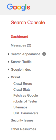
- Login to Google Search Console www.google.com/webmasters
- Click on your website (learn how to set up Google Search Console here if you haven’t done so already)
- Navigate to the “Crawl” button
- Select “Fetch as Google” under the Crawl field
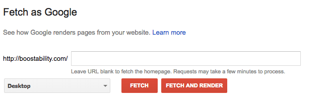
- Enter page URL one at a time
- Select various mobile options from drop down (one at a time)
- Select “Fetch & Render”
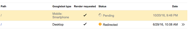
After some time, every page you Fetch as Google will be able to be seen here.
How To Use Google’s Chrome Browser To Test Mobile-Friendliness
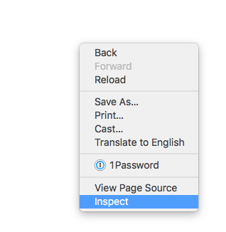
- Open the page in Chrome
- Right-click with your mouse
- Select “Inspect” from the right-click menu
- A new window will appear within the same page you are viewing. From here, select the mobile icon at the top left of the new window section. The icon looks as it does below.
Test Your Website From Your Own Device(s)
Sometimes, how-to directions can all seem like a foreign language, read only by computer geeks and web developers throughout the world. If you haven’t downloaded Google Chrome, and aren’t sure how to use the directions above for Google Search Console either, rely on what you do know!
To test your website yourself, open every mobile device you own (smartphones and tablets) and view each page of your website. Encourage friends and family to use their phones and tablets to test certain pages of your website you may not be sure about.
Note: Your website may look fine from the latest iPhone. Newer phones have more capability to render a variety of website code in a format that is readable to that specific model. However, if your page looks great on a new iPhone, it may look terrible or not load at all on an old Nexus 4. While no one expects you to own every possible model of a phone or tablet, it is important to realize that not all of your website visitors have a brand new phone. In fact, not everyone even has a smart phone at all. In some cases, their phone may only render the text on your website. Thankfully, these cases are minimal. But, in any case, you need to be prepared for all devices.
Open your website in any browser you have or use regularly such as Safari, Firefox, or Chrome. Unfortunately, Internet Explorer won’t necessarily work best for this option.
After loading your website or a specific web page in your browser, shrink your screen down to be as skinny as possible.
Things to look for when testing your website:
- Can you easily find products/service information?
- Is there ample room between text links or image links, allowing for easy mobile-clicking?
- Can you easily find what you’re looking for?
- Is the navigation of your website easily understood?
- Can you easily find your address, business hours, etc.?
- Do any images and text overlap?
- Can you easily find a way to contact your business?
- If you answer no to any of the above questions, you have work to do!
Get a Free Website Analysis
One last tip and trick of the trade, is to make sure you’re analyzing your website often to ensure there aren’t any glaring red flags and issues that could be compromising your website’s performance. Use our free SEO analysis to check your website’s health here!