If you are spending money on promoting your website online, it is only natural to expect more traffic to your site, which will, in turn, mean an increase in your number of sales. But attracting more customers to your site can be counterproductive if your website does not give off the right impression to the potential buyer. If your website’s design looks unprofessional, it makes your prospective customer doubt the credibility and reliability of your company, which could eventually make them leave your website without making a purchase.
Think about the last online purchase you made. Was the website difficult to navigate? Did you find what you wanted right away? What made you push the “buy” button? These are things every customer thinks about when they arrive at a new site. Every new potential customer comes to your site and makes a judgment call about whether or not to make a purchase. In order to influence that judgment call in your favor, it’s important to think about everything from “Does my site look secure enough to make a purchase?” to “Is my site organized enough that my customer can navigate quickly and make purchases easily?”
Website design is one of the most essential elements of your site when it comes to answering these questions. That being said, here are three key elements of website design that will give your site an inviting, professional feel that result in more sales.
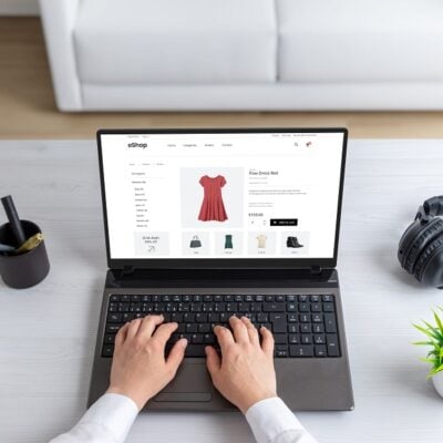
1. Add Impact to Your Site Through Images
A meaningful banner image at the top of your home page can let the customer know right away what you sell and the quality of your product. Plus, it can convey and reinforce your company’s personality and brand image.
When creating banners and adding images, remember that good images essentially do three things. First, they provoke curiosity in your product and company, which makes your potential customer motivated to continue browsing. Second, it provides a visual representation of your product, service, or company, thereby accentuating and complementing any written content on the page. Finally, it reinforces the purpose of your site (or the page), which can be helpful when it comes to your search engine optimization.
Images can really make your site stand out, so using good images wisely will make your site more professional and give your conversion rates a boost.
2. Use Space Wisely
Most site owners tend toward wanting to let their customers know that they can provide anything and everything that the customer needs. Unfortunately, they try to tell the customer this information through wordy content and an overabundance of images. This can be counterproductive. The more content you try to crowd onto a single page, the more overcrowded the page will feel. An overcrowded web page is unappealing for the customer to look at, and it makes your products seem unappealing as well.
Use white or negative space to create a clean site that only lists the most relevant information. Following this principle will make your site more visually appealing, which will make your products seem more appealing. If your products and site look more appealing to your potential customer, it will ultimately produce a higher rate of sale for your site, meaning that your non-crowded web page is more productive and efficient for your site. You should especially use negative space to provide emphasis to your bestselling products and/or direct the customer’s attention to the most relevant information on the page.
3. Feature the Critical
When a site has a clear navigation menu, a visible cart, and a contact phone number in a highly visible spot, customers are more likely to complete a transaction quickly. Featuring the right information in the right place on your site is a vital part of keeping a customer engaged and interested. Plus, it makes it easier for them to complete a purchase, which can only mean higher sales for you.
![]()
When creating your site, make it a goal for the navigation menu, cart, and contact information available on every page. Use clear terms in your navigation, as well. This type of consistency will result in less frustration for your customer; and a happy, un-frustrated customer is more likely to make a purchase. Other features, such as shipping cost calculators and estimated time of delivery widgets, make your site (and your company) seem even more reliable. Ultimately, it’s these small but critical details that can either convert a visitor into a customer or give your visitors a reason to shop elsewhere.
As important as it is to promote yourself online, it is equally essential to make sure that your site is visually appealing enough that it influences your customers to trust and use your site. Take away any reason for your potential customers to navigate away from your site. After all, you’ve worked hard to get promoted online, so do everything you can to make those efforts pay off.